Image resize, compression and format conversion are tedious tasks. However, it's inevitable. Having optimized images is a crucial part for web performance.
It's our responsibility to make our websites load fast. I will share how to automate these tasks in our project with Imagemin, Jimp, Husky and Gulp.
This is the 4th post of the series - Building Personal Website with Eleventy. However, you can jump straight into this article without prior reading as this image optimization workflow setup could be applied to any projects.
Notes:
You may jump straight to the code, jec-11ty-starter on GitHub, but this post contains some useful tips on image optimization and testing, so you might not want to miss!
What are performant images?
In short, performant images are:
- Images with the appropriate format. (e.g. favor
webpthanjpgorpng) - Images with appropriate compression. (e.g. drop the image quality to 80-85%)
- Images with appropriate display size. (e.g. serve smaller images for mobile, and bigger one for desktop)
- Loading lazily. (e.g. only load when user scrolls to it)
A brief walkthrough on the images structure
Most original images in jec.fish have similar traits:
- Images are in various formats. JPG mostly, but also PNG, SVG and GIF.
- 1200 x 675 px - Used as post cover in collection listing (e.g. /blog. /deck) and meta tag for social media.
- 1024 x any height px - Used in content (e.g. a blog post, a presentation deck)
Here is an overview of how images are organized in the project:
# image folder

- assets
  - img
    - blog
      - aaa.jpg
      - bbb.png
      - ddd.gif
    - favicons
      - favicon-96.png
      - favicon-128.png
    - fff.svg
    - ggg-256.jpg
    - hhh.jpg
Task 01: Resize the images
Here are the requirements:
- Resize the images to
500pxwidth. - Only resize images with
jpgorpngformat. - Output the resized files to
assets/img-500folder. - Make the code flexible. For example, we might want to generate images with
300pxin the future. - Exclude files with prefix
favicon-or suffix-256.
We will be using Gulp as our build tool and the Jimp for our image processing library. Take note that you can use Jimp independently to resize the images, but I find it easier to automate that with Gulp.
Let's roll up our sleeves and start by installing the packages!
# run command
npm install gulp gulp-cli jimp through2 -D
.
Next, create a Gulp file and start coding. You can give the file any name and place it anywhere in your project. I prefer to organize build tasks in tasks directory. I followed Angular naming conventions - feature.type.js and dashed-case personally.
# create a gulp file
- assets
  - img
- tasks
  - transform-image.gulp.js # new file
.
Great, here is the code to resize our images:
// tasks/transform-image.gulp.js

const { src, dest, series, parallel } = require('gulp');
const through2 = require('through2');
const Jimp = require('jimp');

const ASSETS_DIR = 'assets';
const EXCLUDE_SRC_GLOB = `!(favicon*|*-256)`;

function resize(from, to, width) {
  const SRC = `../${ASSETS_DIR}/${from}/**/${EXCLUDE_SRC_GLOB}*.{jpg,png}`;
  const DEST = `../${ASSETS_DIR}/${to}`;

  return function resizeImage() {
    const quality = 80;
    return src(SRC)
      .pipe(
        through2.obj(async function (file, _, cb) {
          if (file.isBuffer()) {
            const img = await Jimp.read(file.contents);

            const smallImg = img
              .resize(width, Jimp.AUTO).quality(quality);

            const content = await smallImg
              .getBufferAsync(Jimp.AUTO);

            file.contents = Buffer.from(content);
          }
          cb(null, file);
        })
      )
      .pipe(dest(DEST));
  };
}

// export the task, pass in parameters
exports.default = resize('img', 'img-500', 500);
The code looks slightly lengthy. Let's walk through it together:-
Gulpprovides asrcfunction for us to read and loop through all the files that match the file pattern (glob). We can pass in either a string or array of globs.- Take note of the
SRCandEXCLUDE_SRC_GLOB. This is the glob pattern to select all the files we want in theimgfolder but excludes those we don't. through2is a wrapper for Nodejs stream. We use it to get our image object streams for processing.- Use
Jimpto resize and compress the image quality to just80%quality from the original. - Use the
Gulpbuilt-indestfunction to write our files to the output folder. - Finally, pass in parameters to our
resizefunction and export it as the default task.
The resize function actually returns the resizeImage function. The benefit of wrapping the code this way is that we can perform multiple resizeImage actions with different parameters. For example, if we need to resize the images to 300px as well, we could export this task instead:-
// export the tasks, perform 2 resize action in parallel

exports.default = parallel(
  resize('img', 'img-500', 500),
  resize('img', 'img-300', 300)
);
parallel is the function offered by Gulp. If you want to run the tasks sequentially (one by one) instead, replace parallel with series.
More about Globs
If you want to learn more about file globs, Gulp has a basic documentation for that. The docs also provide links to some more advanced globbing syntax. Read the Micromatch documentation too (link provided in the docs), we use that syntax to form our glob above.
How to run the task?
You can run the task by running this command:
# command to run the task
npx gulp -f tasks/transform-image.gulp.js
I created a script in package.json file to make my life easier:
// package.json
{
  "scripts": {
    "transform-image": "npx gulp -f tasks/transform-image.gulp.js"
  }
  ...
}
I can then run the task by using the command npm run transform-image.
Task 02: Convert the images to webp
WebP is a modern image format that is usually 25-35% smaller than comparable JPG and PNG images. It's supported in most browsers, but... not Safari sadly. 😌 However, we serve the WebP images if it is browser-supported, and fall back to JPG if it isn't. (Further explanation later)
Here are the requirements for conversion:
- Convert the images in both
imgandimg-500folders towebpformat. - Only convert
jpgandpngfiles. - Output the converted files to
webpandwebp-500folders respectively. - Make sure the converted files have
.webpfile extension. - Do not hardcode. We might need to convert more images in different folders in the future.
- Exclude files with prefix
favicon-or suffix-256.
We will be using imagemin and the imagemin-webp plugins. Let's install the packages.
npm install gulp-imagemin imagemin-webp gulp-rename -D.
Next, let's update our transform-image.gulp.js file.
// tasks/transform-image.gulp.js

const { src, dest, series, parallel } = require('gulp');
const imageminWebp = require('imagemin-webp');
const imagemin = require('gulp-imagemin');
const rename = require('gulp-rename');

const ASSETS_DIR = 'assets';
const EXCLUDE_SRC_GLOB = `!(favicon*|*-256|*-512|*-1024)`;

function convert(from, to, extension = 'webp') {
  const SRC = `../${ASSETS_DIR}/${from}/**/${EXCLUDE_SRC_GLOB}*.{jpg,png}`;
  const DEST = `../${ASSETS_DIR}/${to}`;

  return function convertWebp() {
    return src(SRC)
      .pipe(imagemin([imageminWebp({ quality: 80 })]))
      .pipe(
        rename({
          extname: `.${extension}`,
        })
      )
      .pipe(dest(DEST));
  };
}

// export the tasks
exports.default = parallel(
  convert('img', 'webp'),
  convert('img-500', 'webp-500')
);
The code structure is similar to the previous task - read, process and output, but with one extra step at the end: we rename the file with the new extension. (e.g. aaa.jpg will be renamed to aaa.webp).
Can we run both tasks together?
Yes, you can. Update our export task to:
// update the tasks to run all tasks

exports.default = series(
  resize('img', 'img-500', 500),
  parallel(
    convert('img', 'webp'),
    convert('img-500', 'webp-500')
  )
);
The above code means: wait for the image resize task to complete, then start the two image conversion tasks in parallel.
Not good enough...
The above code achieves the purpose. However, there is one drawback. The process will take longer when the number of images grow. It is because the above tasks will always process all the images in the provided folders, regardless of whether the files are already processed or generated.
Let's make it better! We could use gulp-changed to compare the file's last modified date. If the file already exists in the output folder, we won't process it again.
// tasks/transform-image.gulp.js

const changed = require('gulp-changed');

// Modify resizeImage() function
...
    return function resizeImage() {
        const quality = 80;
        return src(SRC)
          // add this line
          .pipe(changed(DEST))

// Modify convertWebp() function
...
    return src(SRC)
      // add this line
      .pipe(changed(DEST, { extension: `.${extension}` }))
...
For the resizeImage function, both input and output filenames are the same, so we just need to call the changed function to compare. However, convertWebp function changes the file extension from JPG to WebP. We need to pass in an additional parameter to the changed function to make it work.
Check the gulp-changed documentation if you want to compare the files with other methods.
Now, try to run the task again. It should convert just the newly added images. Great! We saved our time and the Earth (less processing power 😆) successfully.
But... I don't want to run the command manually every time
Sure. You can set up a new GitHub Actions to do so (read my 2nd post on Setting up GitHub Actions and Firebase Hosting).
However, I prefer to do it locally, because I need to visualize the images during development or writing time (also to save some build minutes on GitHub 😛).
One option is to create a prestart NPM script to run the transform-image every time before starting the local server.
//  package.json

{
  "scripts": {
    "prestart": "npm run transform-image"
    ...
  }
}
Another option is to run the tasks every time before we git push or git commit our changes. To do this, you can use the Husky package.
# install Husky
npm install husky -D
Once installed, add this configuration to your package.json:
//  package.json

{
  "husky": {
    "hooks": {
      "pre-push": "npm run transform-image"
    }
  }
}
Test it! The transform-image task will run every time you push your code.
Serving responsive images in HTML
Instead of using the <img> tag in HTML, we can wrap it with the <picture> element to serve responsive images. For example, with our output files above, our HTML could be:
<picture>
  <source media="(max-width: 500px)"
    srcset="/assets/webp-500/hhh.webp" type="image/webp">
  <source media="(min-width: 501px)"
    srcset="/assets/webp/hhh.webp" type="image/webp">
  <source media="(max-width: 500px)"
    srcset="/assets/img-500/hhh.jpg">
  <img src="/assets/img/hhh.jpg" loading="lazy" alt="caption">
</picture>
Native image lazy loading support has landed in majority of the browsers! Not yet in Safari... 😌
We can add the loading ="lazy" tag in the img to signal the browser to load the image lazily.
Here is the short explanation on what the code above did. 👉🏼
If the browser supports WebP, it will serve images:
- from the
/webp-500folder if the screen size is small. (within500px) - from the
/webpfolder if the screen size is over500px.
If WebP format is not supported, the browser will use the JPG images instead, either from /img-500 or /img depending on the screen size.
Please note that the above code works in all browsers.
There are many ways you can configure the source tag, whether to serve responsive images by media size, device pixel ratio, sizes, etc. Read more in this post here by Eric on Smashing Magazine!
But... the HTML code is lengthy
Indeed, and we don't want to write the same code over and over again. In the coming post, I will share how to create a reusable function to do that, plus anti content jumping when the image is loading. Stay tuned! (hint: by creating shortcode in Eleventy)
Bonus 1/3: What are the alternatives?
What if I want to transform an image one-off manually?
Sure, use this website squoosh.app to resize, compress and convert the image format! Drop in an image, and select the options you need and download the processed image.
In fact, I use it quite often myself. Pretty handy.
How to do this on demand (on the fly)?
Yes. You can use Thumbor (open source project, host it yourself) to do it. Read the web.dev article for details.
Another one would be Cloudinary, and they offer free quota. It is user friendly and supports image format conversion on the fly!
Last one is to roll your own API with the libraries above (imagemin and Jimp)!
Bonus 2/3: How to know which image is serving currently?
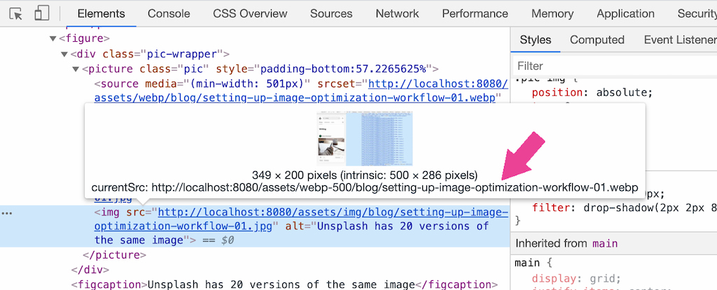
When serving responsive images, you might want to test if the right images are served. You can use DevTools to do so (Of course I use Chrome DevTools 😆).
Say you want to test on a single image. You can hover to the image element in the DevTools Element panel, and it will show you a pop-up, showing which is the currentSrc of the image.
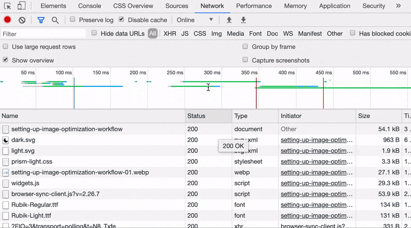
If you want to examine the images in bulk, open the Network Panel, filter network requests by Img type, check the URLs or further filter by format or filename.
How about test serving images in different device pixel ratios (DPR)? Toggle the Device toolbar, and add the DPR selection.
Another easy way is to right click the image, open it in a new tab and check the URL. No DevTools needed! 😆
Bonus 3/3: How's other sites serving their images?
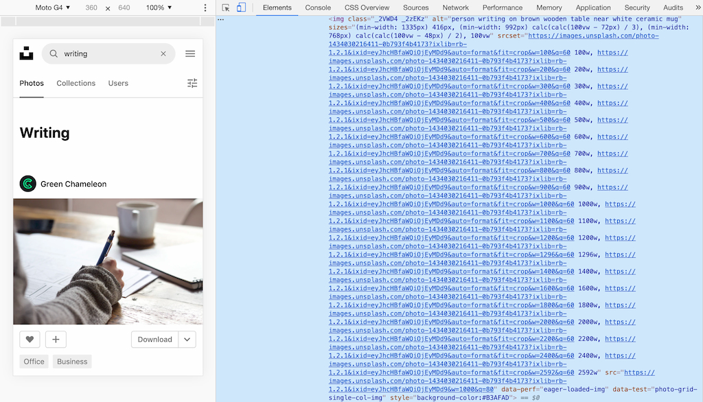
Let's learn from one of the best image websites. Try inspect unsplash.com with DevTools. (right click on the photo > select "Inspect").
Guess how many srcset they have for the one image? 20.
Instagram and Pinterest have lesser srcset. Pick and set the appropriate one for your site. 😃 The best thing about the web is it's open. Inspect and learn!
Alrighty, what's next?
Yay! We have learnt how to optimize images, serve them responsively and test it. 🎉 On behalf of the web residents, thanks for saving our data, hah! 🙇🏻♀️
This is how I optimize the images in my site jec.fish as well. I have a presentation (slides and video) on web optimization - images, fonts and JavaScript, do check it out.
.
In the coming posts, I plan to write about more on how I built my website with 11ty:
- Building Personal Static Site with Eleventy ✅
- Setting up GitHub Actions and Firebase Hosting ✅
- Customizing File Structure, URLs and Browsersync ✅
- Automating Image Optimization Workflow ✅
- Setting up SEO and Google Analytics ✅
- Minifying HTML, JavaScript, CSS - Automate Inline ✅
- How many favicons should you have in your site? ✅
- Creating Filters, Shortcodes and Plugins ✅
- Supporting Dark Mode in Your Website ✅
- and probably more!
Let me know if the above topics interest you.
.
Here's the GitHub repo for the code above: jec-11ty-starter. I'll update the repo whenever I write a new post.
That's all. Happy coding!
Have something to say? Leave me comments on Twitter 👇🏼
Follow my writing: @jecfish